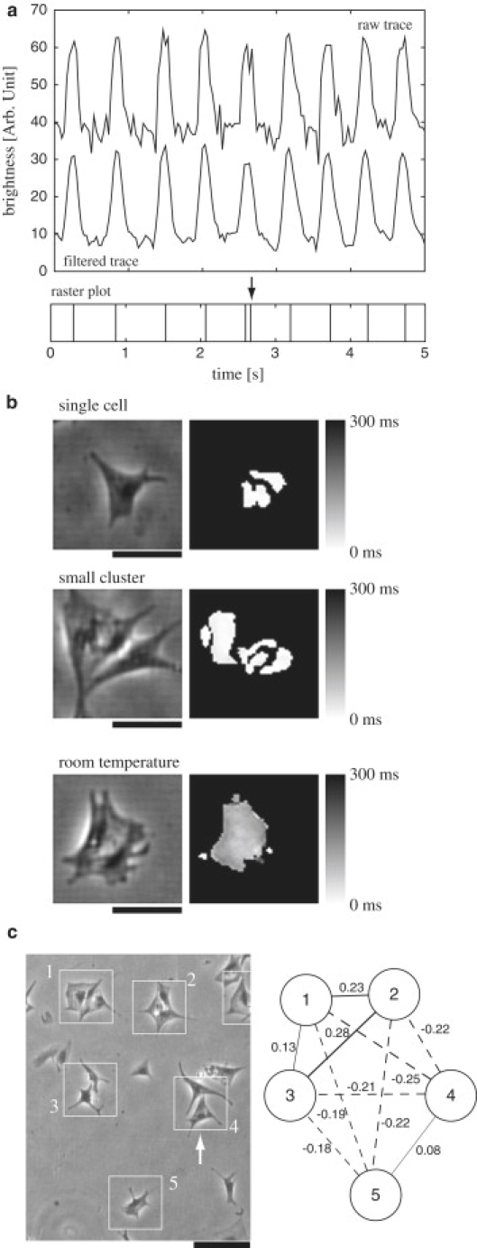
Figure 1.

(a) An example of a trace of brightness of a pixel on the cell indicated by the arrow in panel c. The upper trace in the upper panel represents raw data. The lower trace represents filtered data, which was generated by taking a moving average over three video frames. The value of brightness is expressed at the eight-bit resolution, and the baselines of the traces are arbitrarily shifted so that they can be seen easier. The lower panel represents a raster plot constructed from the filtered data. Each vertical line indicates the occurrence of a beat. In a raster plot, fictitious spikes were sometimes generated due to noise in the raw trace. An example of these fictitious spikes is indicated by an arrow above the raster plot. These fictitious spikes were identified by the procedure described in the text and were removed. (b) Contraction-time map. The left panels exemplify phase-contrast images of cells. The scale bar represents 50 μm. In the right panel, a map of the delay in the timings of contraction (sharp changes in the brightness) from the earliest timing in each contraction, averaged over 1000 frames (∼30 contractions), was represented. The gray level represents the magnitude of delay as indicated in the right bar. The top row displays an example of a map for an isolated single cell. The middle row exemplifies the case of a small cluster. In these cases, the delays were typically within one frame (33 ms). The average of delays over 25 cells was 0.44 ± 0.11 frames. For comparison, the contraction-time map for a small cluster at 27°C in the absence of bicarbonate buffer system, which displays propagation of contraction waves within a cell, is shown at the bottom. In this case, significant delays were observed. (c) (Left) A phase-contrast image of several cardiac muscle cells in the same field of view. The solid boxes indicate the cells whose spontaneous contractions have been analyzed. The scale bar represents 100 μm. (Right) Pairwise correlations of the time series of beat rates for five cells shown in the left panel. Each circle with a number corresponds to the same-numbered cell in the left panel. A line connecting two circles represents the correlation coefficient, r, of the beat rate; the thickness of the line is proportional to the magnitude of r, and the solid and dashed lines mean positive and negative signs for r, respectively. The value of r is also indicated on each line. The average of r for these five cells was −0.055 ± 0.066.
