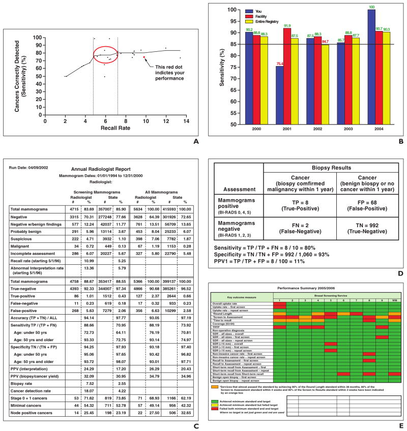
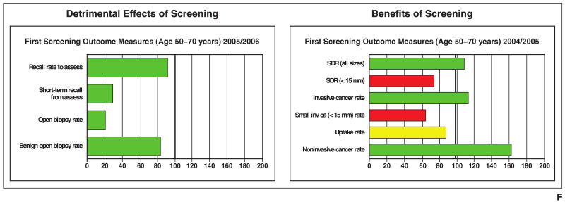
Fig. 1. Examples of audit reports presented during focus groups and interviews.
A, Recall by sensitivity scattergram.
B, Vertical bar graph with benchmark (85%) shows sensitivity among screening examinations. A fourth vertical bar representing sensitivity data for Breast Cancer Surveillance Consortium was added to this figure in subsequent focus groups.
C, Single-page table. TP = true-positive, TN = true-negative, FP = false-positive, FN = false-negative, PPV = positive predictive value.
D, 2 × 2 table. PPV1 = percentage of all positive screening examinations that result in a cancer diagnosis within 1 year.
E, Color-coded chart.
F, Color-coded bar graph. Green or red indicates radiologist achieved or failed to achieve both minimum standard and target. Yellow indicates achieved minium standard but failed target. SDR = standardized detection ratio, inv ca = invasive cancer.


