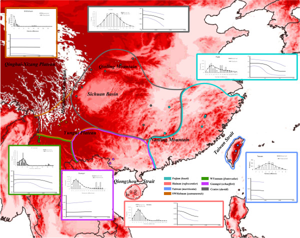
Figure 2.
Mismatch distribution and Bayesian skyline plot for geographical groups of A. morrisonia. Coloured dots stand for phylogenetic relationships of sampling sites and colour boundaries indicate the distribution ranges of each subspecies of A. morrisonia according to Cheng et al. The histograms in the MD represent the observed frequencies of pairwise differences among haplotypes and the line shows the curve expected for a population that has expanded. The X axis in the BSP represent numbers of mutations and the Y axis is Ne*μ (effective population size * mutation rate per generation). Italic characters label the main geographical barriers in South China.

