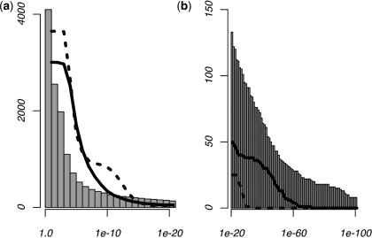
Figure 2.
Results from the comprehensive MLF analysis. Histograms show the cumulative number of 6-mers with positional enrichment according to their P-values in human promoters. The plots give the number of 6-mers producing Psim-values under the given thresholds during simulation analyses, where Psim represents the most significant P-value for each individual 6-mer across 100 simulated data sets. Solid plots refer to simulations conducted according to the dinucleotide frequencies across each position within the promoter, while the dotted lines represent those generated using mono-nucleotide frequencies. P-value thresholds above 1e–20 are shown in (a), while the contrast between the results of the human and simulated analyses for which P < 1e – 20 is illustrated in (b). Note that the dinucleotide-generated simulated data sets produced a significantly larger number of predictions than the mono-nucleotide-generated simulated data, while the real human promoters produce more predictions than either of the control data sets.

