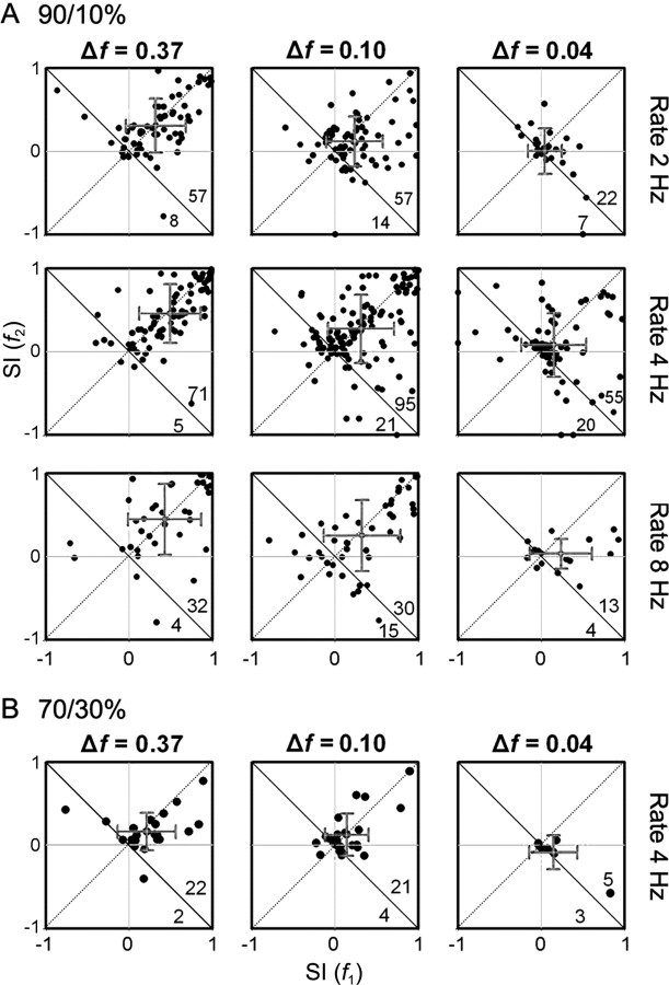
Figure 5.
A, B, Scatter plots of the frequency-specific SI at different probabilities (A, 90/10%; B, 70/30%), frequency contrasts (columns), and stimulation rates (rows). Because each neuron was tested using several combinations of parameters, individual neurons may be represented in more than one panel. The numbers on the bottom right indicate the number of dots on each side of the descending diagonal. The gray crosses indicate the mean and SD for each axis.

