
Figure 2.
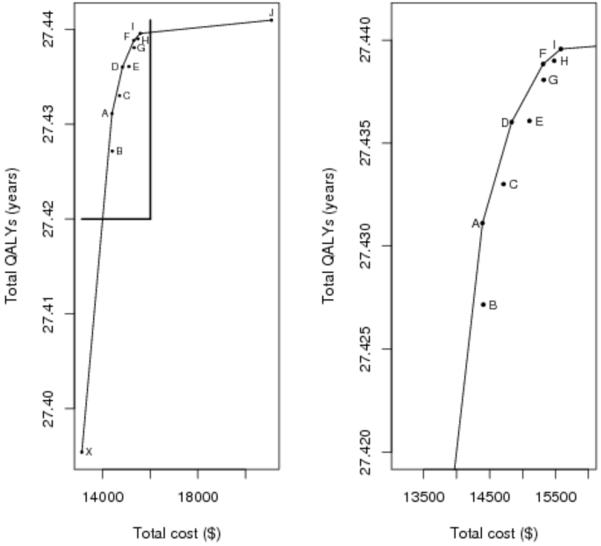
Tradeoff plot for strategies A-J (left) and excluding strategy J (right). X-axis is mean total cost in U.S. dollars. Y-axis is mean quality-adjusted life-years. Dominated strategies (B,C,E,G,H) fall below the line of efficiency connecting the non-dominated alternatives (A,D,F,I,J). The plot on the right allows better visualization of strategies A-I.