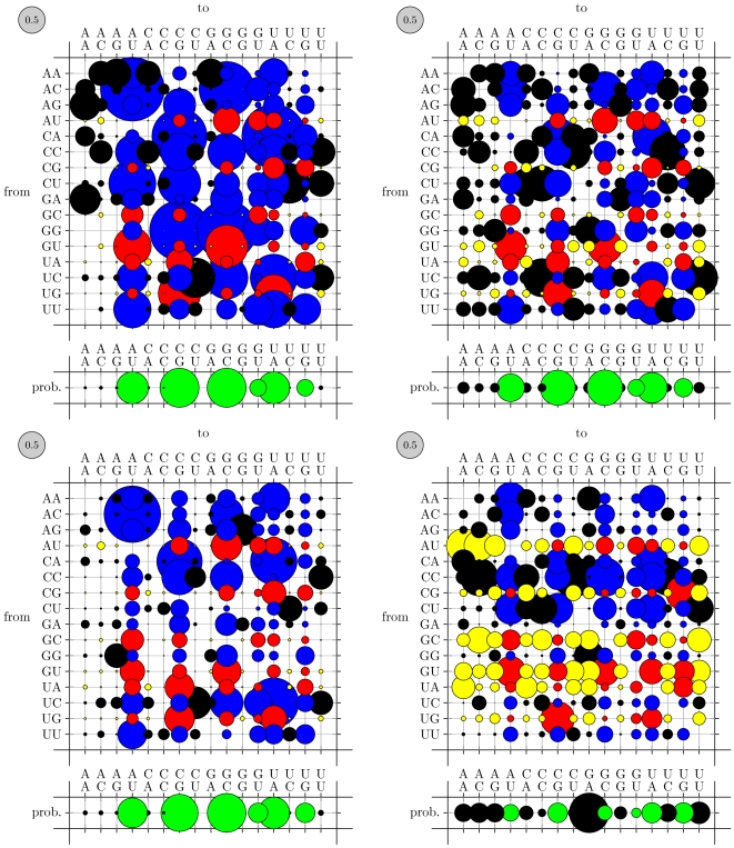
Figure 4. Substitution rate matrices for co-evolving base-pairs.
The area of each bubble is proportional to the corresponding rate (the gray bubble in the upper-left of each plot shows the scale: its area corresponds to 0.5 substitutions per unit of time). The color of a bubble indicates whether the source and destination base-pairs are canonically paired. (Red, Yellow) circles show substitutions from canonical to (canonical, non-canonical) base-pairs; (Blue, Black) show substitutions from not paired to (canonical, non-canonical). The area of the bubbles in the row beneath each plot indicates the equilibrium distribution of the mutation process (canonical base pairs are green, non-canonical are black). The RFAM-trained rates (upper right) show higher rates of mutations away from canonical pairings than do the mix80-trained rates (lower left) or the original PFOLD rates (upper left). In the closing base-pair of stems (lower right) one can observe a bias towards G-A base-pairs in the equilibrium distribution as well as high rates of mutations away from canonical pairings (yellow bubbles). See “Patterns of nucleotide substitution in non-coding RNA” for further details.

