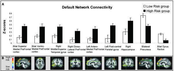
Figure 4.
Resting DMN connectivity with the pC/rsp seed in nine different regions between high risk and low risk individuals. A) Mean z-scores for pC/rsp connectivity for both risk groups in regions showing significant group differences. B) Voxel-wise between-group comparison maps of z-score correlations (−1 to +1) showing increased (hot colors) and decreased (cool colors) connectivity in the high risk group compared to the low risk group for each region. Error bars represent the standard error of the mean.

