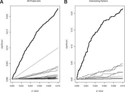
Fig. 3.
Proportion of probe sets called significant as a function of P-value threshold. In (A and B), the results for PROMISE are shown by the thick black curve and the reference line y=x is shown by the thick gray line. In (A), the results for pairwise overlap analyses are shown by the thin black lines. In (B), the results for individual endpoint analyses are shown by the thin black lines.

