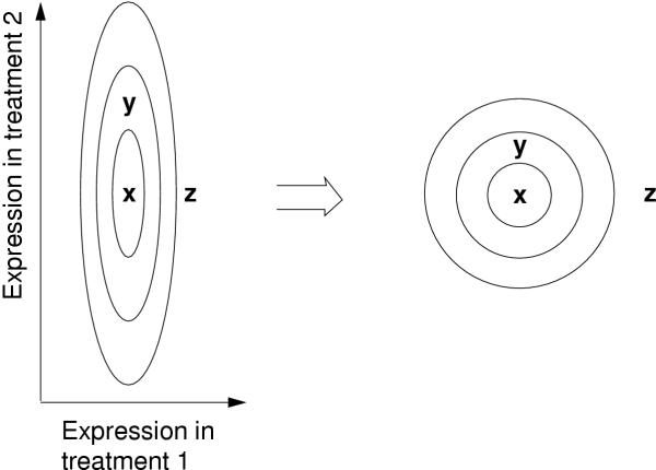
Figure 1.
Schematic illustration of the change of metric by functional classes of genes. The expression of three genes, x, y, and z, has been measured in two treatments. The ellipses are kinds of contour lines; compared to the point x, on each line the distribution of functional classes differs by the same amount. In the new metric that takes the contour lines into account (on the right), y is much closer to x. A gene at y is more likely to have a similar functional classes than at z, which is expressed by the new metric.

