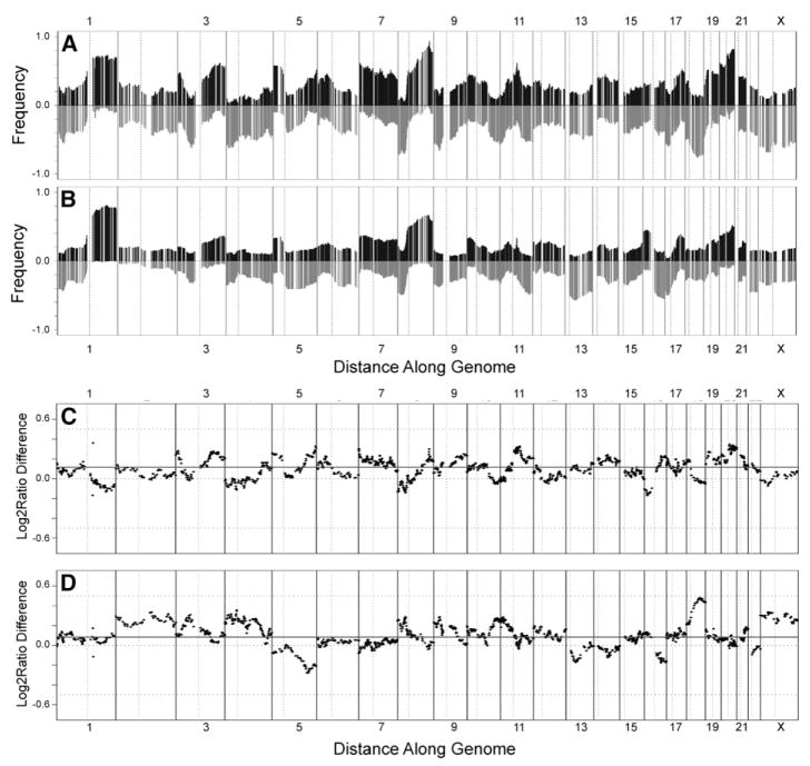
Figure 1. Comparison of array CGH analyses of human breast cancer cell lines and primary tumors.
A and B: Frequencies of significant increases or decreases in genome copy number are plotted as a function of genome location for 51 cell lines (A) and 145 primary tumors (Fridlyand et al., 2006) (B). Positive values indicate frequencies of samples showing copy number increases [Log2(copy number) > 0.3], and negative values indicate frequencies of samples showing copy number decreases [Log2(copy number) < −0.3].
C and D: Differences (y axis) between frequencies of gains and losses across the genome for the cell lines versus the tumors are represented in C and D, respectively. Genome copy number aberration frequencies are plotted as a function of location position in the genome beginning at 1pter to the left and ending at Xqter to the right (chromosome locations are indicated by numbers above and below graphs). Vertical lines indicate chromosome boundaries. Vertical dotted lines indicate centromere locations.

