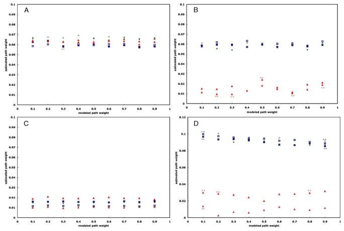
Fig. 4.
Graphs of the estimated path weight values versus modeled path weights for the path from Region 1 to Region 3 for each pairing of computational method and data modeling technique for each TR (TR=2 s: solid; TR=1 s: open). Figure a shows the results from SEM; Figure b, autoregressive analysis; Figure c, Granger causality; and Figure d, dynamic causal modeling. Task-related variance is depicted by blue squares; steady-state task performance, green circles; and trimmed time series, red triangles. Those estimates lying outside the 95% confidence interval of the median estimated path weight value are indicated by either asterisks (**; TR=2 s) or plus signs (++; TR= 1 s). In all cases, none of the pairings indicated system dynamics where none were modeled

