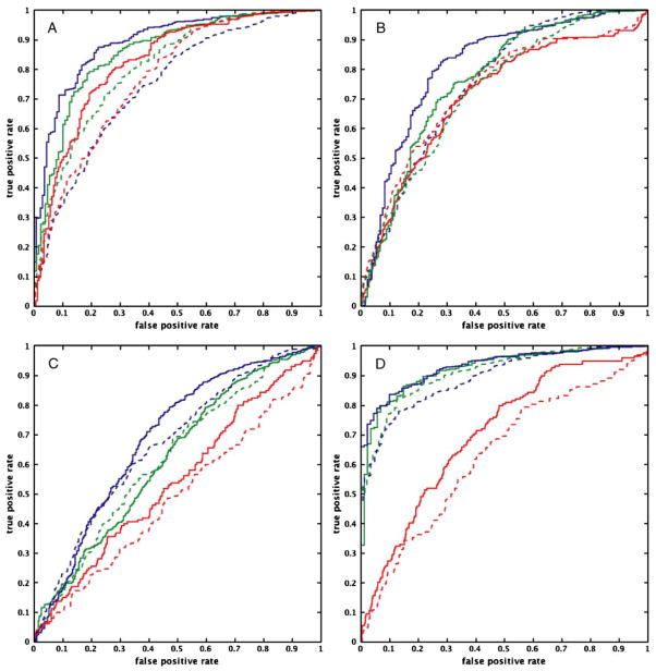
Fig. 6.
ROC curves for each pairing of computational method and data modeling technique for each TR (TR=2 s: dashed line; TR=1 s: bold line) for the path from Region 1 to Region 2. Figure a shows the results from SEM; Figure b, autoregressive analysis; Figure c, Granger causality; and Figure d, dynamic causal modeling. Task-related variance is represented by the blue solid lines; steady-state task performance, green dotted lines; and trimmed time series, red dashed lines. The curves suggest that the performance of structural equation modeling, autoregressive analysis, and dynamic causal modeling improves with a reduction of TR, regardless of the source of variance. This improvement in performance is not as apparent for Granger causality

