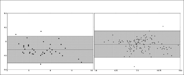
Figure 2.

Bias plot comparing cardiac output measurements from continuous cardiac output PAC and EDM in women (left) and men (right). The mean of the two methods can be seen on the X-axis. The difference between the two methods can be seen on the Y-axis. The shaded area indicates the 95% confidence interval (CI). Note the significantly greater negative measurement bias noted in women - Table 1 for exact values.
