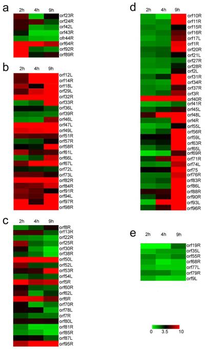
Figure 4. Pearson correlation.
Genes differentially expressed in FHM cells at various times after FV3 infection are depicted by cluster analysis. Columns represent the time at which various RNAs were isolated and the rows represent an individual gene. The level of expression is shown by the color of the individual genes and ranges from green (down regulated) to red (upregulated) according to the scale shown on the figure. Clustering was initially performed using expression data from time course infections in productively infected cells (Table 1). However, the clusters were manually adjusted taking into consideration results from CHX and DNA block microarray experiments and PCR findings. Panel A: IE-Tr genes; Panel B: IE-S genes; Panel C: DE genes; Panel D: L genes; Panel E: Unknown genes.

