
Figure 2.
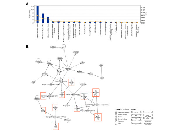
Functional categorization, and Ingenuity Pathway Analysis (IPA) network of the top selected genes by microarray. (A) Histogram represents the most significant canonical pathways generated using IPA software including the 44 genes discriminating the three study groups. Ratio was calculated by dividing the number of genes from our dataset that map to each single pathway by the total number of genes included into the canonical pathway. P-value was calculated using the right-tailed Fisher's Exact Test. Ratio and P-value are indicated on the left and right side of the histogram, respectively. (B) Network, algorithmically generated based on their functional and biological connectivity, was graphically represented as nodes (genes) and edges (the biological relationship between genes). Shaded nodes represented genes identified by our microarray analysis and others (empty nodes) were those that IPA automatically included because biologically linked to our genes based on evidence in the literature. Red shaded genes were those involved in oxidative phosphorylation system (OXPHOS).