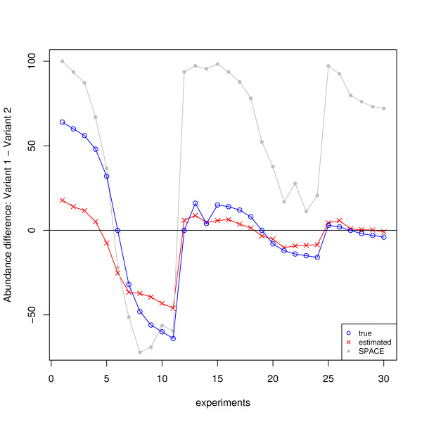
Figure 4.
The concentration differences between variant 1 and variant 2 for MAPT (HG-SV data): predicted vs. true. The predicted concentration differences and the true differences are labeled by red crosses and green circles respectively. For comparison purpose, the estimates using the SPACE algorithm [39] are also plotted, represented by gray dots.

