
Figure 4.
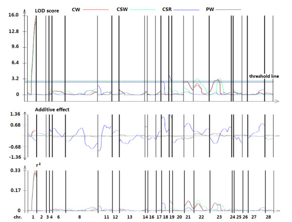
Graphical overview of our QTL mapping results. From top to bottom, the three graphs show the LOD scores, additive effects, and r2 values for each trait (each in a different color). Each chromosome is indicated by vertical lines, with the chromosome numbers along the bottom. In the LOD score graph, a threshold line is indicated for each trait based on the threshold values. Peaks above the threshold line indicate QTL.