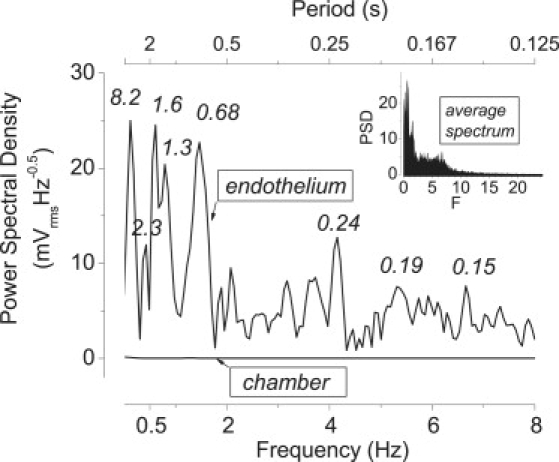
Figure 3.

Frequency spectrum of the TEPD. For the curve shown in the insert, the frequency spectra of 10 experiments were averaged (average multiple curves routine; Origin). In the main plot, only the frequency domain of most interest is shown. The upper curve (endothelium) shows an individual frequency spectrum of the TEPD. Numbers near the peaks denote their periods τ in s. The lower line (chamber) shows a control spectrum of the potential difference obtained with the solution-filled chamber (n = 87).
