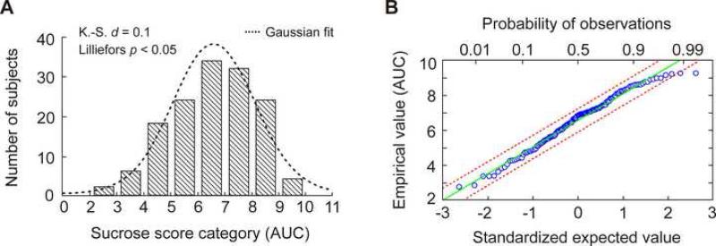
Figure 1.
Sucrose sensitivity scores distributed normally in the population of 144 unrelated test subjects. (A) Frequency histogram showing the distribution of AUC scores. K.-S. d, Kolmogorov-Smirnov test for normality of empirical distribution. Lilliefors p, Lilliefors test for significance of K.-S. difference statistic. (B) Quantile-quantile plot of the empirical variable against the standardized normal variable. The vertical scale denotes the individual AUC values sorted in order from smallest to largest. The bottom axis shows a normally distributed variable. The top axis denotes probability of observations of a normally distributed variable. The regression line (green) is a reference demonstrating theoretically perfect fit between the empirical and theoretical distributions. Red dashed lines indicate 99% confidence intervals.

