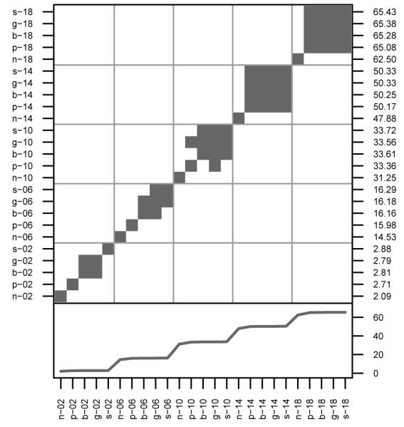
Figure 1. Comparisons of Gene Dispersal.

In the upper panel, shaded cells denote simulation pairs with means that were not significantly different from one another. The left and bottom axes identify the parameters sets specific to each cell. The right axes identifies the mean of each simulation. The bottom panel is a plot of the means. Each simulation is identified as ‘i—j,’ where ‘i’ represents NSI, PSI, BSI, GSI, or SSI and ‘j’ represents σp.
