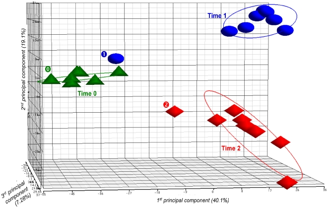
Figure 2. Principal component analysis (PCA) plot showing transcriptome differences between expression microarray data of GBS NEM316 strain incubated in human blood at 37°C.
Samples were analyzed at time 0, and after 30 min and 90 min of incubation. The PCA plot captures the variance in a dataset in terms of principal components and displays the most significant of these on the x, y, and z axes. The percentages of the total variation that are accounted for by the 1st, 2nd, and 3rd principal components are shown on the x-, y- and z-axes labels. Plots are colored and shaped by time point. Plots for donor A blood sample are specifically marked (“ ” for time 0, “
 ” for time 1, and “
 ” for time 2).

