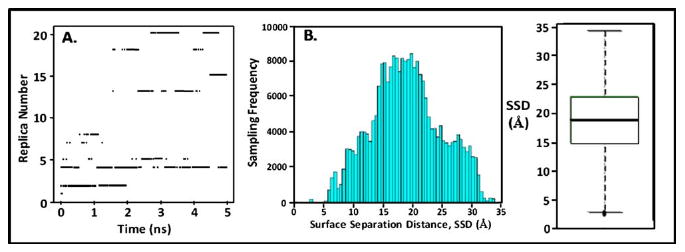
Fig. 6.

(a) Time series of replica diffusion for the 5 ns biased-REMD simulation. Dark dashes indicate which of the 21 replicas occupied the 310 K temperature level at a given point in time. (b) Histogram showing the density of sampling for each increment of SSD space. (c) Box-plot statistical analysis of the histogram presented in (b) showing the median (thick line in box), first and third quartiles (box around the median), range bars (lines (whiskers) above and below the box, lower range ≡ Q1−1.5 [Q3–Q1], upper range ≡ Q3+1.5 [Q3–Q1]), and population outliers (dotted points outside of the range bars).
