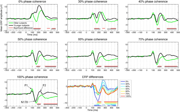
Figure 4.
Running tests of mean ERP group differences, at the electrode presenting the best model fit, between younger (black) and older (green) observers. For the different levels of phase coherence, in the different subplots, horizontal red lines indicate time points at which a difference was significant (95% percentile bootstrap). The horizontal black lines show the results of the same analysis, performed on the modelled ERP instead of the original ERP data. The lower right subplot directly compares the differences across the seven levels of phase coherence. In this subplot, the horizontal lines are colour coded to represent time points of significant effects in the different conditions.

