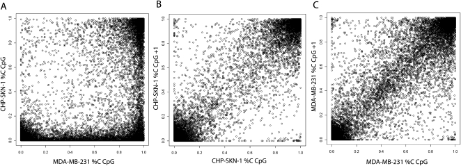
Figure 3.
Distribution of CpG methylation frequencies. (A) A pairwise comparison of methylation at individual CpG sites between the two samples is shown. (B,C) For each sample, scatter plots of the proportion methylated for each CpG (x-axis) and the subsequent neighboring CpG within an island (y-axis, CpG+1) is displayed. This analysis was restricted to those CpGs with at least 40 reads in both samples.

