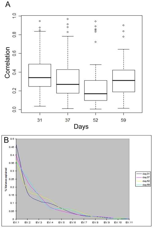
Figure 1. (A) Box-plots of (absolute) pair-wise correlations and (B) Scree plots from PCA.
(A) The horizontal axis indicates the four days of analysis, and the vertical axis shows the distribution of absolute pair-wise correlations among the 11 immunological response parameters. Open circles indicate parameter pairs with particularly strong correlations (“outliers” in the box-plots). Note that on day 52, the majority of parameters have lower correlations overall, but there are several that are highly correlated (anti-correlated). (B) The ordered PCA components are shown on the horizontal axis (EV stands for eigenvector). The vertical axis shows the share of overall variability explained by each component, in different colors for each of the four days of analysis.

