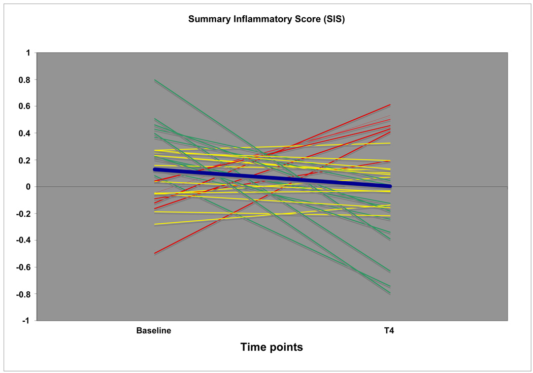
Figure 4.
Graphic illustration of Summary Inflammatory Scores at Baseline (average of T1 and T2) and T4. Red lines represent patients with markedly increased overall levels of systemic inflammation after therapy, green lines patients with reduced levels of inflammation, and yellow lines patients with seemingly stable levels. The blue line denotes the average SIS response in the entire patient group.

