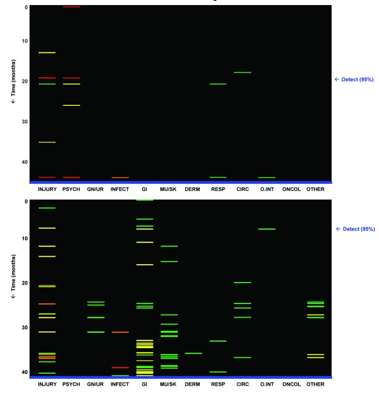
Fig 6 Prototype visualisations designed to provide physician with a broad overview of a patient’s longitudinal history. Each small coloured bar represents diagnosis recorded for patient at particular point in time with risk (chronologically from top to bottom), in one of 12 general clinical categories (from left to right, see table A on bmj.com). Arrow on right indicates point in time at which high risk of abuse would have first been detected using threshold set for 95% specificity. For patient in top panel, with few visits stored in dataset, risk of abuse would have been detected 27 months before first recorded diagnosis of abuse. For patient in bottom panel, with large number of visits stored in dataset, abuse risk would have been detected 34 months before first recorded abuse diagnosis. Grey scale versions of these visualisations are available from the author

An official website of the United States government
Here's how you know
Official websites use .gov
A
.gov website belongs to an official
government organization in the United States.
Secure .gov websites use HTTPS
A lock (
) or https:// means you've safely
connected to the .gov website. Share sensitive
information only on official, secure websites.
