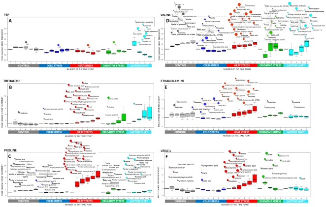
Figure 5. Relative changes of metabolites concentrations and changes in their network connectivity.
Pattern of concentration changes for six selected metabolites (A: PEP (phosphoenolpyruvate); B: trehalose; C: proline; D: valine; E: ethanolamine; F: uracil) as a function of time during different stress and control conditions ( the time points relate to the time points as indicated in figure 1a) and part of the respective metabolite-metabolite correlation network observed in response to applied treatments showing the neighbours of these six metabolites ( if any). Boxplots are generated using fold change values of individual biological replicates in relation to the average value in time point 1 – before the treatment. Significantly correlating metabolites are displayed as nodes connected to the metabolite of interest with an edge. Correlation analysis confers only time points 2,3,4,5 as described in the main text. Red edge - treatment specific correlation; gray edge - correlations common for all treatments; solid edge – positive correlation; dashed edge – negative correlation. The size of the node is proportional to the number of stress specific correlations exhibited by this metabolite. Metabolites exhibiting significant changes in absolute concentrations are marked with a bold font face.

