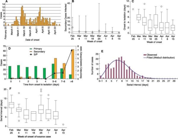
Fig. 1.

Quantitative epidemiology of SARS as reported from Singapore. (A) Epidemic curve for cases reported up to 5 May 2003. (B) The number of secondary cases infected by an index case reported by week (mean indicated by circles; minimum and maximum indicated by error bars); horizontal line indicates 1, the minimum for epidemic growth. (C) Time from onset of symptoms until hospital isolation of the case, stratified by week of onset. (D) Number of primary cases (green) by time from symptom onset to isolation, number of secondary cases infected by such cases (orange), and mean number of secondary cases per primary case. (E) Serial intervals for known transmissions in Singapore: time from onset of symptoms in index case to onset of symptoms in secondary case with fitted Weibull distribution. (F) Serial intervals stratified by week of onset in the index case. (B), (C), and (F) exclude the final week of data to avoid possible censoring bias. In the box-whisker plots [(C) and (F)], the box extends from the 25th to 75th percentile of observations [interquartile range (IQR)], with the center line indicating the median. The bars define the upper and lower adjacent values, defined as 75th percentile + 1.5 IQR and 25th percentile − 1.5 IQR. The circles denote observed points outside the adjacent values or single observations in a period.
