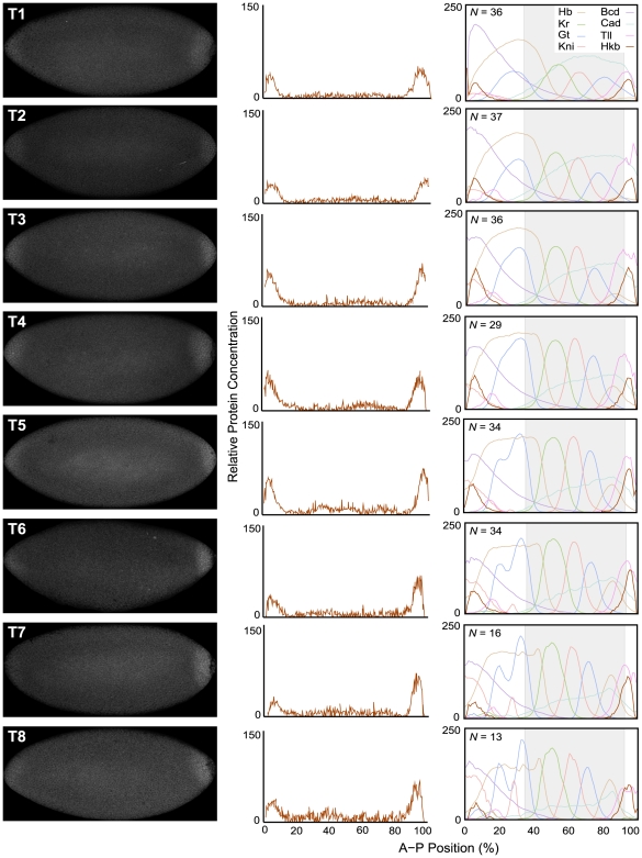
Figure 2. Quantitative analysis of hkb expression.
This figure shows images of representative embryos stained against Hkb protein for each time class (T1–T8) during cleavage cycle 14A (left), with their corresponding quantified Hkb expression profiles (middle). Integrated Hkb expression data for each time class are shown, and compared to integrated profiles of Bcd, Cad, Hb, Kr, Gt, Kni, and Tll from the FlyEx data base [14],[15], on the right. N indicates the number of embryos on which each integrated Hkb pattern is based. Horizontal plot axes represent percent A–P position (where 0% is the anterior pole). Grey shaded background (on the right) indicates the trunk region of the embryo, which is covered by gap gene circuit models. Vertical plot axes show relative protein concentration (based on fluorescence intensity on an 8-bit range of 0 to 255). Integrated Hkb patterns have been scaled to facilitate comparison to other expression profiles. See Methods for details on time classes and data quantification.

