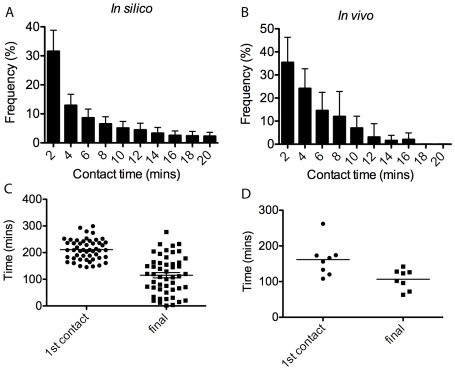
Figure 10. Graphs comparing in vivo and in silico filopodia contact data.
(A) Frequency plot of simulation contact time distribution, averaged over 50 runs. (B) in vivo frequency, averaged over eight anastomosis events in live imaging of the developing zebrafish. (C) Scatter plot of the time from the first contact made until fusion and time from the last contact made until fusion, in silico and (D) in vivo.

