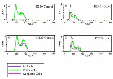
Figure 7.

A-D: Overlaid cell cycle histograms generated using gated TUNEL assay data. The x axis shows the relative DNA content of individual cells, the y axis shows cell number. The first peaks, above channel 200 represent cells in G1, the second peak represents cells in G2 phase of the cell cycle. The purple line represents all cells analyzed, the green line represents those cells that are still viable and the pink line represents cells with an increased number of double strand breaks, which is indicative of apoptosis. 7A: HL60 control, 7B: HL60 cells exposed to LD for 4 hours, 7C: HT29 control and 7D: HT29 cells exposed to LD for 24 hours.
