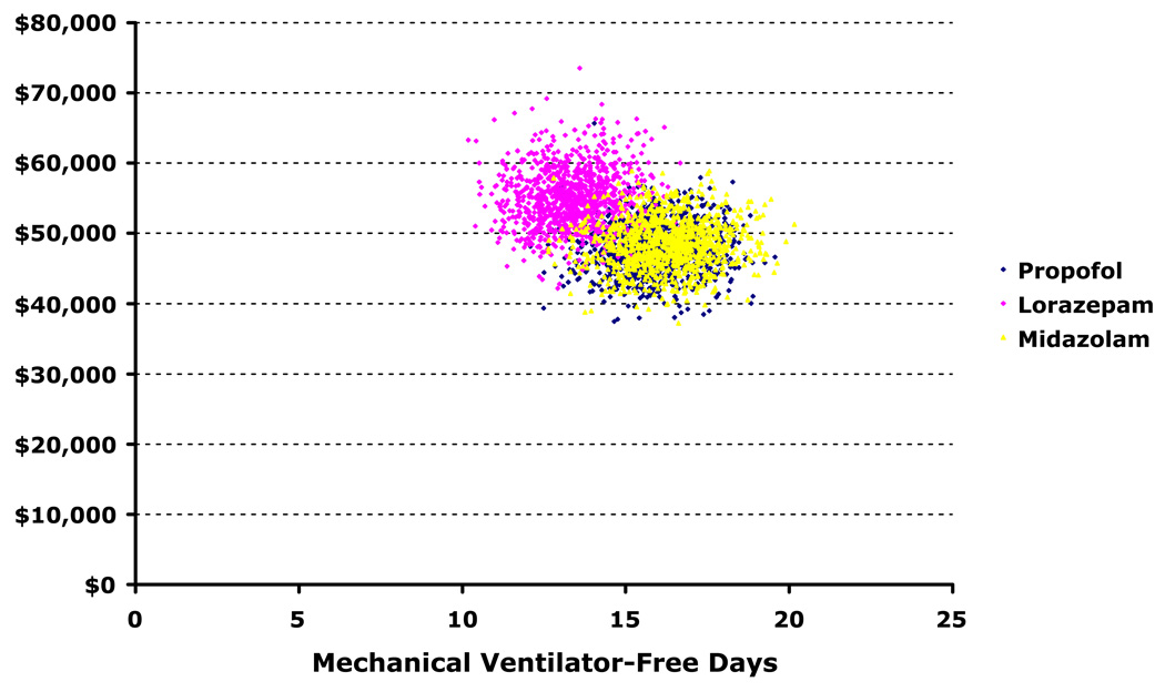
Figure 2. Scatterplot of probabilistic analyses comparing costs and effects.
These scatterplots depict the results of 1,000 simulations during which important clinical variables were allowed to vary simultaneously within predefined distributions (see Methods). In contrast to Figure 4, the axes represent the actual (not incremental) costs and effects of each separate trial. This figure demonstrates near duplication of propofol (blue circles) costs and effects for midazolam (yellow circles), though little overlap of lorazepam with either of these groups—emphasizing the dominance of propofol and midazolam over lorazepam (pink circles).

