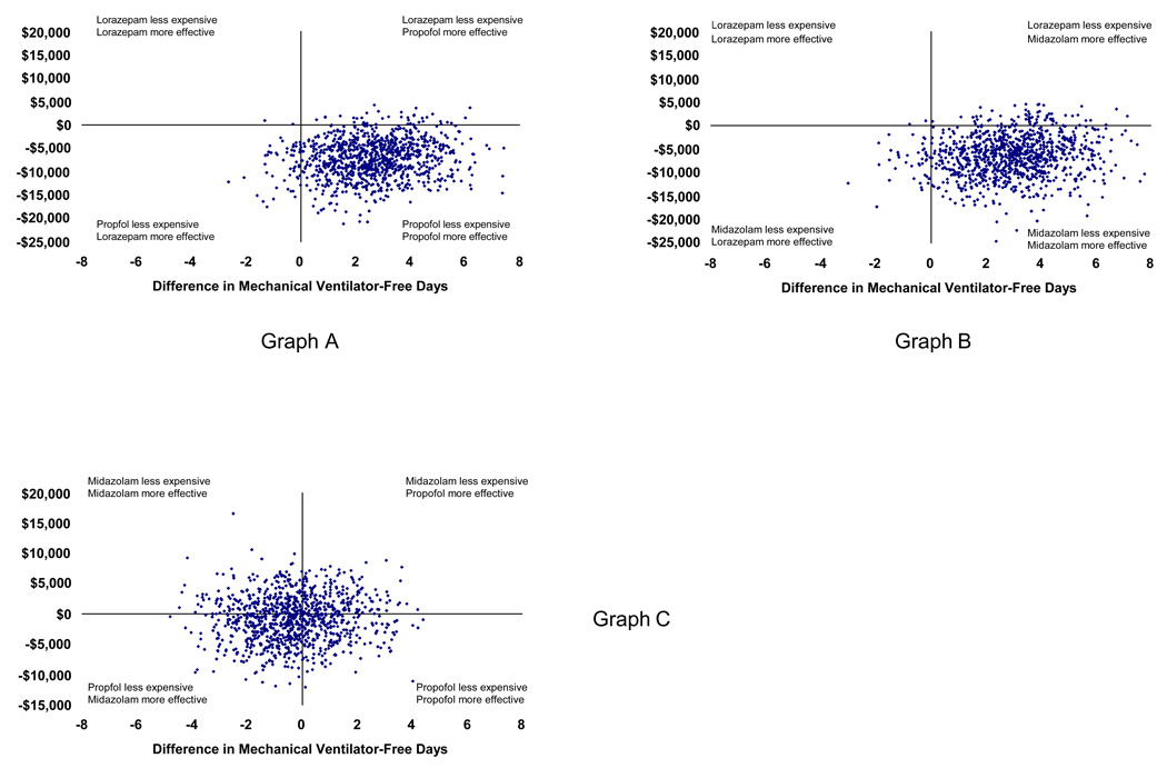
Figure 3. Scatterplot of probabilistic analyses comparing incremental costs and effects.
These scatterplots graph the results of 1,000 simulations during which important clinical variables were allowed to vary simultaneously within predefined distributions (see Methods). The x axis represents the incremental difference in mechanical ventilator-free days by group (propofol – lorazepam in Graph A, midazolam – lorazepam in Graph B, and propofol – midazolam in Graph C). The y axis represents incremental costs calculated in a similar fashion. The clustering of simulation results in the lower right quadrant in Graphs A and B demonstrates the comparative dominance of propofol and midazolam over lorazepam. The clustering of analyses at the intersection of the axes in Graph C suggests that there is little evidence that clinically or economically important differences exist between propofol and midazolam.

