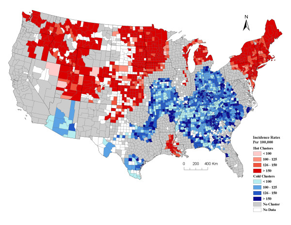
Figure 3.
Geographical clusters of U.S. counties with significant high or low prostate cancer incidence rates among Caucasians (including Hispanics) analyzed at a 200 km distance band. The graduated red and blue colors show high (hot) and low (cold) clusters respectively, for age-adjusted average annual incidence rates (2000/2001-2004/2005) of prostate cancer. The counties with no color are those with either no data or counts less than 3-5. Graduated colors were assigned to the hot and cold clusters based on the incidence rate for counties. In total there were 2,777 counties used in the prostate cancer cluster analysis. Data source: National Cancer Institute-State Cancer Profiles and State Cancer Registries.

