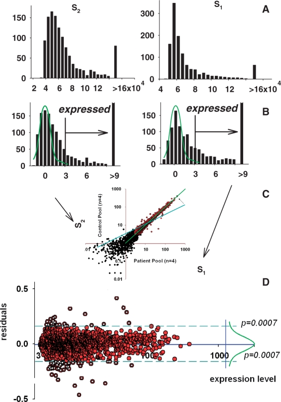
Figure 4.
Two-sample data adjustment. (A) Histograms for the spots in two arrays. (B) Histograms for normalized to background and log-transformed data. Normal distribution curves fitted to the truncated histograms (as in Figure 3) are shown in green. (C) Profiles of control pool (y-axis) and patient pool (x-axis) adjusted to each other through linear regression with excluded background noise (black spots) and potential outliers. Blue line, position of the regression line before adjustment; green line, position after adjustment. (D) Data of the plot presented in the transformed coordinates. Right side shows the nearly normal distribution of the deviations from equity of expression. The use of the majority of equally expressed genes as an internal standard presents opportunity to select differentially expressed genes as outliers from this standard beyond of some statistical thresholds. These genes are shown as open circles.

