Graph 2.

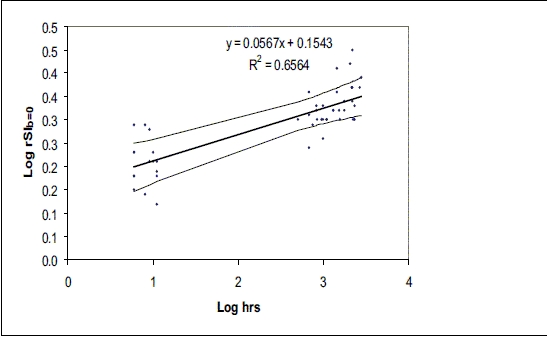
Scatterplot of the log of SI b=0 vs log hours since symptom onset; the thick line represents the line of best fit and thin line lines represent 95% CI

Scatterplot of the log of SI b=0 vs log hours since symptom onset; the thick line represents the line of best fit and thin line lines represent 95% CI