Figure 1.
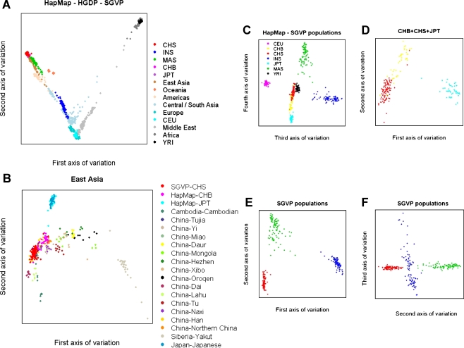
Principal component analysis plots of genetic diversity across HapMap, HGDP, and SGVP populations. Each figure represents the genetic diversity seen across the populations considered, with each sample mapped onto a spectrum of genetic variation represented by two axes of variations corresponding to two eigenvectors of the PCA. (A) Individuals from each population in the HapMap and SGVP are represented by a unique color, while samples from HGDP are broadly grouped by geography in which a unique color is assigned to each geographical location. (B) Comparison between CHS and samples from Far East Asia found in the HapMap and HGDP. (C) A plot of the third and fourth axes of variation for the seven populations from HapMap and SGVP. (D) A plot of the first two axes of variation when the PCA is run on only the three Far East Asian populations comprising the Singapore Chinese, HapMap Han Chinese in Beijing, China, and Japanese in Tokyo, Japan. (E) A plot of the first two principal components in a separate analysis within the three SGVP populations. (F) A plot of the second and third principal components within the SGVP populations. The same color scheme has been used in C–F; the legend for the color assignment can be found in C.

