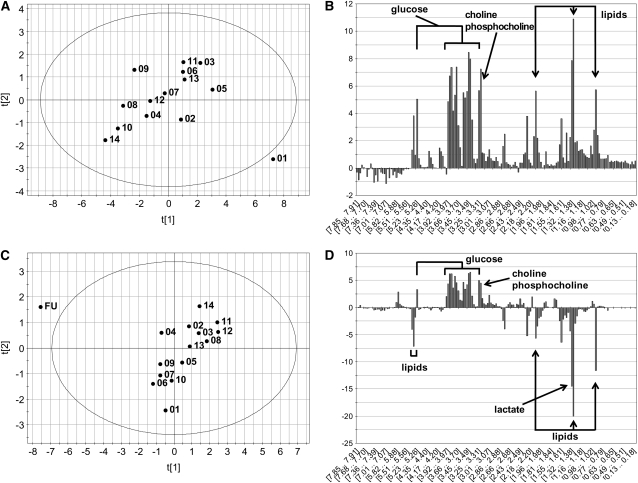
FIGURE 3.
Principal components scores and contributions plots from 2 subjects that showed a single day that was clearly distinct from the others. A: The scores plot of this subject is annotated with the days of each sample, and it is clear that day 1 is an outlier from the group. B: The contributions plot shows that this is largely due to elevated glucose and lipids in the day 1 sample. C: The scores plot from this subject shows that the follow-up (FU) day was clearly different. D: The contributions plot shows that this difference shown in panel C is due to reductions in lipids and elevations in glucose. The abscissa on the contributions plot is composed of the spectral bins used in the principal components analysis model. The first and second principal components for each of the scores plots are noted as t[1] and t[2], respectively.

