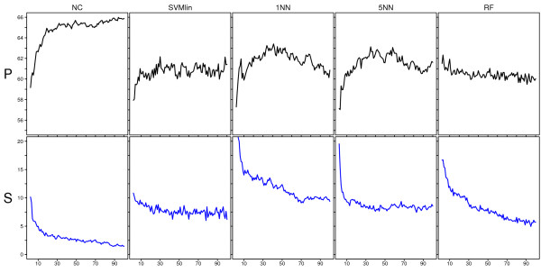
Figure 7.
Performance and stability curves for the Rosetta dataset. P and S-curves for the Rosetta data for various classifiers. The x-axis shows the signature size, the y-axis in the upper panel gives the average balanced accuracy over 50 splits and the y-axis in the lower panel gives the average percentage of cases over 50 splits with a map-score larger than 35. Each column shows the results for a different classifier.

