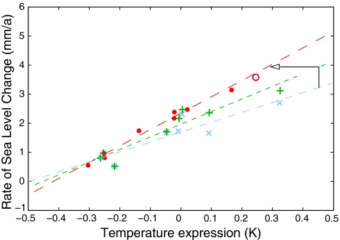
Fig. 4.
Blue crosses show 15-year averages of global temperature (relative to 1951–1980) versus the rate of sea-level rise, with their linear least-squares fit, as in R07 (3) but using 15-year bins. The green crosses show the adjustment to sea level induced by the reservoir correction (22), leading to a steeper slope. The red dots show the expression (T + b/a dT/dt) appearing on the right of Eq. 2. This increases the slope again and leads to a much tighter linear fit. The open red circle is a data point based on the satellite altimetry data for 1993–2008. The arrow indicates how the linear trend line changes from that of R07 (blue) to the green one by adjusting the sea-level data (a change along the vertical axis) and then again to the red line by adjusting the temperature expression (along the horizontal axis).

