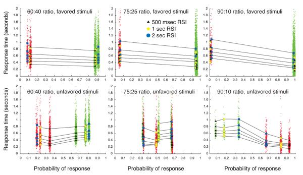
Figure 11.
Quantile probability plots for all conditions of Experiment 2. Superimposed scatterplots of RT data are plotted in green for correct responses and red for errors. Left column: 60:40 stimulus ratio. Middle column: 75:25 stimulus ratio. Right column: 90:10 stimulus ratio. The top row of panels shows quantile probability plots for responses to the more likely stimulus. The bottom row plots responses to the less likely stimulus; note the exchange of correct and error probabilities as stimulus-ratio asymmetry increases.

