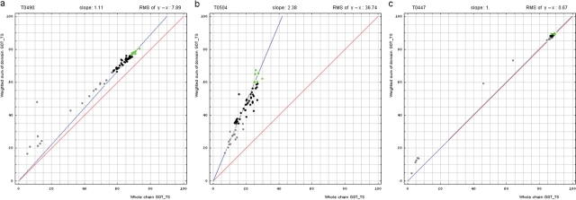
Figure 1.
Correlation between domain-based evaluation (y, vertical axis) and whole-chain GDT-TS (x, horizontal axis). (a) A typical correlation plot for target T0490. (b) A plot of target T0504 showing beneficial domain evaluation for this target. (c) A plot of target T0447 showing unnecessary domain evaluation for this target. Each point represents first server models. Green, gray and black points represent the top 10, the bottom 25% and the remaining prediction models, respectively. The blue line is the best-fit slope (intersection 0) to the top 10 server models. The red line is the diagonal. The slope and RMS y − x distance for the top 10 models (average difference between the weighted sum of domain GDT-TS scores and the whole-chain GDT-TS score) are shown above the plot.

