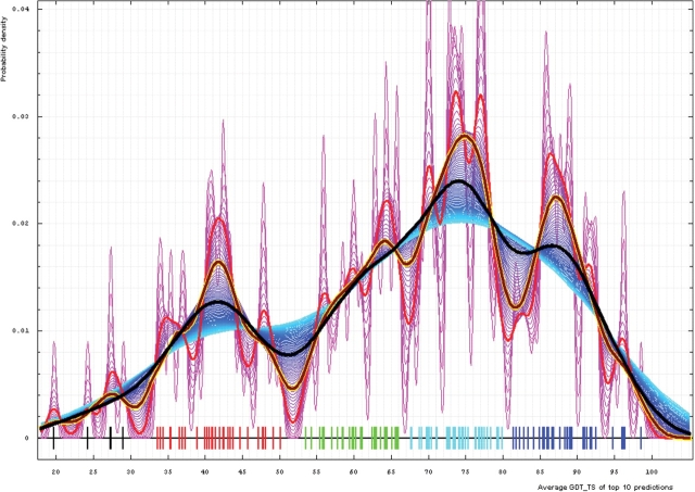
Figure 4.
Gaussian kernel density estimation of domain GDT-TS scores for the first model GDT-TS averaged over top 10 servers and plotted at various bandwidths (= standard deviations). These average GDT-TS scores for all domains are shown as a spectrum along the horizontal axis: each bar represents a domain. The bars are colored according to the category suggested by this analysis: black, FM; red, FR; green, CM_H; cyan, CM_M; blue, CM_E. The family of curves with varying bandwidth is shown. Bandwidth varies from 0.3 to 8.2 GDT-TS% units with a step of 0.1, which corresponds to the color ramp from magenta through blue to cyan. Thicker curves: red, yellow-framed brown and black correspond to bandwidths 1, 2 and 4, respectively.

