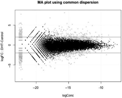
Fig. 1.
DGE data can be visualized as ‘MA’ plots (log ratio versus abundance), just as with microarray data where each dot represents a gene. This plot shows RNA-seq gene expression for DHT-stimulated versus Control LNCaP cells, as described in Li et al. (2008). The smear of points on the left side signifies that genes were observed in only one group of replicate samples and the points marked ‘×’ denote the top 500 differentially expressed genes.

