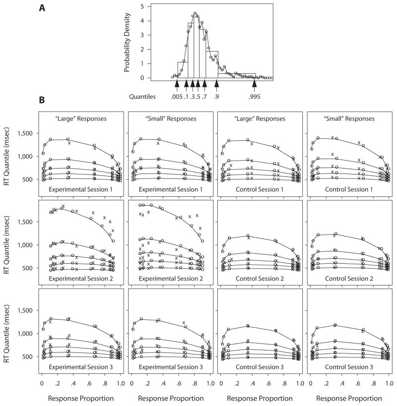
Figure 3.
Response time (RT) quantiles and response proportions. Panel A shows an RT distribution histogram (the circles joined by lines), with the quantile RTs identified on the abscissa and as rectangles with .2 area between the .1, .3, .5 (median), .7, and .9 quantiles and .095 area between extremes, the .005 and .1 quantiles and the .9 and .995 quantiles (we use .005 and .995 for illustration as being a little less variable than the maximum and minimum). Panel A shows that the six rectangles between and outside the five quantiles approximate the density function rather well. Panel B shows quantile probability functions for “large” and “small” responses for the three sessions in the experimental group (Session 1 baseline, Session 2 sleep-deprived, and Session 3 recovery) and in the control group. The quantile RTs in each vertical line of Xs from the bottom to the top are the .1, .3, .5 (median), .7, and .9 quantiles, respectively. The Xs represent the data, and the os joined with lines represent the predicted quantile RTs from the diffusion model. The eight columns of Xs in each graph are for eight different stimulus categories—namely, 31–35, 36–40, 41–45, 46–50, 51–55, 56–60, 61–65, and 66–70 asterisks for “large” responses; for “small” responses, the columns of Xs are for the same eight stimulus categories, but in the opposite order. The horizontal position of the columns of Xs indicates the response proportion for that category. Note that extreme error quantiles could not be computed for some of the numerosity categories because there were too few errors for some participants, so only the median RT value is plotted.

