
Figure 3.
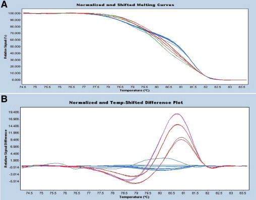
High resolution melting (HRM) difference point plot for KRAS. A: Normalized high resolution melt curves. PCR products are labeled with a fluorescent dye and the fluorescent signal is plotted as the temperature increases. Strand melting results in a decrease in fluorescent signal. B: The difference plot displays the melting curve of each sample subtracted from a reference curve to visually accentuate the melt curve differences and aid in genotype grouping. Products of three mutant templates are shown in red and pink. Products of wild-type templates are shown in blue. The upper (pink curve) represents the codon 12 mutation G12S, whereas the red curves represent amplification products for a single mutation at codon 12 (G12V) at two different concentrations. The latter two curves are similar shapes but have different heights due to variation in the quantity of PCR amplicon.