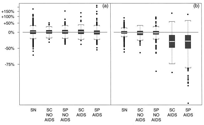
Figure 3.
Boxplots (light middle bar denotes median, ends of dark boxes denote 25th and 75th percentiles, brackets indicate 150% of IQR outside the quartiles, outliers are indicated with points) displaying the distribution of estimated parameters by group. (a) CD3+ slope (expressed as change in CD3+ count per year) before IP [(1 − 10β̂i1) × 100]. (b) CD3+ slope (change per year) after IP [(1 − 10β̂i2) × 100].

