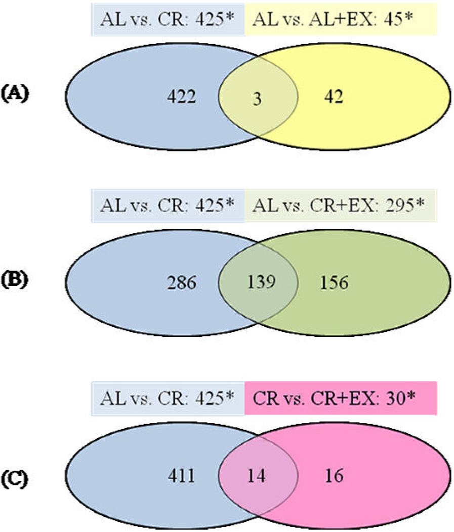
Figure 2. Venn diagrams comparing mouse mammary gene expression patterns among treatment groups.
Statistically significant gene expression changes (p ≤ 0.005; fold change ≥1.5) were identified from comparisons of the treatment groups by microarray analysis. Total numbers of changes in gene expression are indicated above each diagram by asterisks. Numbers of genes differentially expressed in different treatments are indicated inside the circles, with the number of genes common to between-group comparisons noted inside the overlapping areas of circles. A) CR and AL+EX interventions compared to AL. B) CR and CR+EX interventions compared to AL. C) CR vs. AL and CR vs. CR+EX comparisons.

